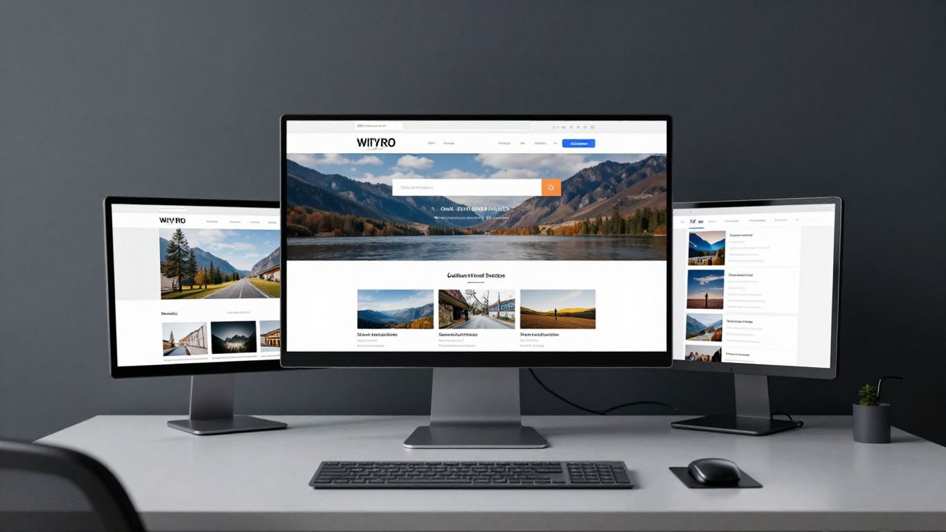
Auditing existing performance provides the data foundation necessary for a successful redesign.
Key Takeaways
Optimising your online presence requires a strategic approach that balances emotional resonance with technical precision. By implementing these practices, you can effectively drive support for your mission.
Auditing existing performance provides the data foundation necessary for a successful redesign.
Simplifying your donation flow reduces friction and encourages more frequent contributions.
High-contrast design elements and intuitive call-to-action placement keep supporters focused.
Visual storytelling creates an immediate emotional connection, building trust with your audience.
Inclusive digital standards ensure that all potential supporters can engage with your cause effortlessly.
Audit your existing charity website performance
Before you begin your next project, you must look objectively at how your current site is performing. Understanding where users struggle is the most effective way to improve your charity website design. If your data indicates that people are landing on your site but leaving without interacting, you have a baseline for improvement.
Analysing current conversion rates and drop-off points
You need to look at your analytics to see exactly where visitors are losing interest. By pinpointing the specific pages where traffic exits, you can conduct honest diagnostics of your funnel. Identifying these leaks allows you to repair the structure before adding new content.
Gathering qualitative feedback from recurring donors
Numbers tell only half the story; direct feedback provides the remaining context. Asking long-term supporters about their experience helps bridge the gap between technical metrics and human emotion. This feedback often highlights nuances that automated tools miss, such as confusing labels or missing information.
Reviewing competitor websites for design inspiration
Looking at how others in your space approach their digital presence can be illuminating. Observing their navigation patterns and message clarity often reveals gaps in your own strategy. Just remember to maintain your unique voice while learning from the functional successes of inspiring charity websites.
Setting clear KPIs for your project
Define exactly what success looks like for this iteration. Whether you choose to focus on donor retention rates, total conversion volume, or page engagement time, clarity prevents feature creep. Use this table as a starting point for tracking your progress across different metrics.
Metric Category | Current Baseline | Target Improvement | Potential Impact |
|---|---|---|---|
Donation Conversion | 1.2% | 2.5% | Increased Revenue |
Bounce Rate | 65% | 45% | Better Engagement |
Mobile Interaction | 40% | 60% | Wider Accessibility |
Establishing these clear markers ensures that every design choice you make contributes directly to your overarching institutional goals.
Streamlining user experience for seamless donations
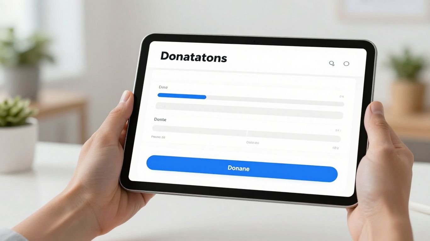
Clutter is the enemy of generosity when you are asking someone to support your work. A seamless donation experience should feel natural, removing any doubt or distraction from the moment a user decides to give. Charity Design Co. offers strategy-led design to help simplify these processes for nonprofits.
Reducing steps in the donation process
Every unnecessary field or page transition is an opportunity for a supporter to abandon their contribution. By keeping the donation path short and direct, you show respect for the donor's time. Focus on collecting only the essential information needed to process a transaction.
Designing intuitive navigation menus for mobile and desktop
Users often switch between devices, meaning your navigation must be robust regardless of screen size. If a user cannot find your primary giving page within three seconds, your layout is likely too complex. A clean, logical structure helps visitors find their way to your active impact pages.
Implementing secure and familiar payment gateways
Trust is fundamental when handling financial information. Supporters expect a secure environment that feels both professional and safe to use. Using standard, recognizable payment processors helps mitigate the anxiety that can sometimes accompany making an online gift.
Addressing page load speeds to prevent bounce rates
You should regularly check your site performance, as slow loading times are a primary driver for frustrated visitors leaving a page. Fast-loading elements ensure that your message reaches the user instantly. Consider the following steps to boost your response times:
Compressing all high-resolution images to reduce weight.
Minimizing redundant third-party scripts that slow execution.
Enabling browser caching to speed up return visits.
Optimising these technical details allows your content to do the work of connecting with the user without unnecessary technical friction.
Optimising calls to action to drive engagement
Your primary goal should always remain clear through every page of your site. If a reader feels inspired to support your mission, the path to doing so must be obvious and accessible at that exact moment. Effective buttons guide the gaze and provide a sense of urgency without being aggressive.
Using high-contrast colours for donation buttons
Colour choice influences where eyes travel when a page loads. A button that blends into the background is functionally useless, regardless of how persuasive your surrounding text happens to be. Ensure your main action stands out against brand colours to catch the user's attention quickly.
Placement strategies for primary and secondary actions
Buttons should occupy logical spaces, such as at the end of a compelling story or in a fixed header. Primary actions—like "Donate Now"—require more visual weight than secondary actions like "Sign up for our newsletter." Balance the two so the primary path remains dominant.
Crafting persuasive and donor-centric micro-copy
Words matter as much as visuals when moving a donor to action. Instead of technical labels, use language that speaks directly to the impact a gift provides. Simple shifts in phrasing can change the way a donor views their contribution to your work.
Creating recurring giving options to maintain revenue
Building a steady stream of support is vital for long-term health and predictability. Offering a simple recurring option during the standard donation process makes it easy for loyal supporters to commit to long-term impact. This creates a sustainable foundation for your organisation.
Leveraging visual storytelling to build emotional trust

Visuals communicate values faster than any text you could write. When done well, they ground your mission in the real world and demonstrate the value of the support you receive. Following a scalable design system helps ensure that these visuals remain consistent across all your pages.
Selecting high-impact photography and videography
Authentic images of your work in action perform significantly better than generic stock photos. They provide a window into the change you are creating and invite the user into that space. Focus on showing the outcome of the support provided by your donors.
Using white space to focus attention on your cause
White space is not wasted space; it is a tool for clarity. By giving your content room to breathe, you ensure that the text and imagery you do choose have maximum impact. It focuses the user's eye exactly where they need to look.
Communicating your theory of change through infographics
Complex problems require clear explanations that do not overwhelm the reader. Infographics can distill sophisticated impact data into digestible segments. This allows you to show your logic without burying the audience in academic jargon.
Balancing professional branding with an authentic visual voice
Consistency creates an impression of competence, while authenticity creates an impression of heart. You should aim for a professional aesthetic while keeping the human element front and centre. This balance suggests a mature organisation that is still deeply connected to its roots.
Building credibility and trust for prospective supporters
Trust is built through transparency and clear, verifiable evidence of impact. Potential supporters want to know that their gifts are being managed responsibly and that the organisation follows through on its promises. Being open about your processes helps ease common concerns potential donors may have.
Displaying impact reports and financial transparency
Publishing clear reports shows that you hold yourself accountable to those you serve. Providing easy access to annual financials is a cornerstone of responsible stewardship. This transparency is a key indicator of an organisation’s long-term health and mission focus.
Incorporating social proof via donor testimonials
Seeing others support your cause encourages new individuals to join in. Testimonials should feel natural rather than staged, reflecting the real reasons people choose to engage with your work. Authenticity in this space provides others with the permission they need to get involved.
Clearly stating your charity registration details
Legal compliance is not just a bureaucratic necessity; it is a signal of legitimacy. Displaying registration numbers and status prominently gives donors the assurance that they are dealing with a recognised entity. This is an essential component of establishing digital credibility.
Showing recognisable endorsements and partnership seals
Endorsements serve as a shorthand for trust, signalling that other respected bodies believe in your work. Whether through certification seals, partner logos, or media mentions, these marks validate your efforts to a wider audience. They serve as a quick way to demonstrate proof of impact.
Improving website accessibility and inclusivity
Your site must be usable by everyone, regardless of the tools they use to navigate the web. Prioritising accessibility is both an ethical commitment and a functional necessity. A truly inclusive design ensures that no potential donor is sidelined by barriers that could have been removed.
Meeting WCAG standards for digital accessibility
These guidelines serve as the benchmark for creating an equitable digital environment. Following them ensures your content is interpretable by diverse users, which is the cornerstone of inclusive design. It moves your accessibility efforts from an abstract goal to a technical reality.
Ensuring colour contrast ratios for text readability
People perceive information differently, and high contrast is vital for those with visual impairments. Checking your ratios ensures your message remains legible under various circumstances. It is a simple technical fix with a massive impact on universal reach.
Supporting screen reader and keyboard navigation
Not every user interacts with their mouse or trackpad. Designing for keyboard use ensures that users with motor impairments can traverse your site as easily as anyone else. This fundamental level of inclusivity confirms your dedication to serving your entire potential community.
Designing inclusive forms that cater to diverse donor needs
Forms should be straightforward for everybody including those using assistive technology. By ensuring clear labelling and descriptive errors, you avoid common pitfalls that frustrate a wide range of your visitors. An inclusive form is one that facilitates completion by every single user.
Conclusion
Redesigning your digital home is a continuous process that requires a delicate balance of data-driven decisions and genuine storytelling to maintain strong donor relationships. By auditing your current performance, reducing friction in your donation pipeline, and ensuring your site is accessible to everyone, you can build a more resilient and impactful presence. As you move forward, keep these core principles at the heart of your work to ensure that every aspect of your site remains transparent, inclusive, and effective in its mission to inspire generosity.
Frequently Asked Questions
How often should I audit my charity website?
You should conduct a thorough performance audit at least once every six months. This frequency allows you to catch design trends or technical issues before they negatively impact your donation goals.
Should I move my website to a new platform?
Changing platforms is a significant undertaking that should be based on data. If your current system prevents you from making updates or hinders donation functionality, then a move may be necessary to support your growth.
What is the most important element on my homepage?
Your most important element is a clear, compelling call to action that directs visitors toward your mission. Everything else on the page should exist solely to support that primary objective.
How do I balance professional branding with emotional storytelling?
Professional branding provides the structure that makes your emotional storytelling reliable. You can achieve this by using a high-quality visual style guide that allows for heart-centred content while maintaining a polished, coherent appearance.
Are free website builders suitable for all charities?
Free builders can work for smaller organisations but often present limitations in the long term. Consider your future expansion needs and the potential loss of brand control before deciding on a free-tier solution.
What are the first signs that my website needs a redesign?
Key signs include a high bounce rate, difficulty updating your own content, or data showing that your donation pages are being abandoned by users. These are clear signals that your user experience requires attention.
How can I make my forms more inclusive?
Make sure your form fields have clear, persistent labels and that the tab order matches the visual flow of the page. This ensures that users relying on screen readers or keyboards can complete the process without confusion.