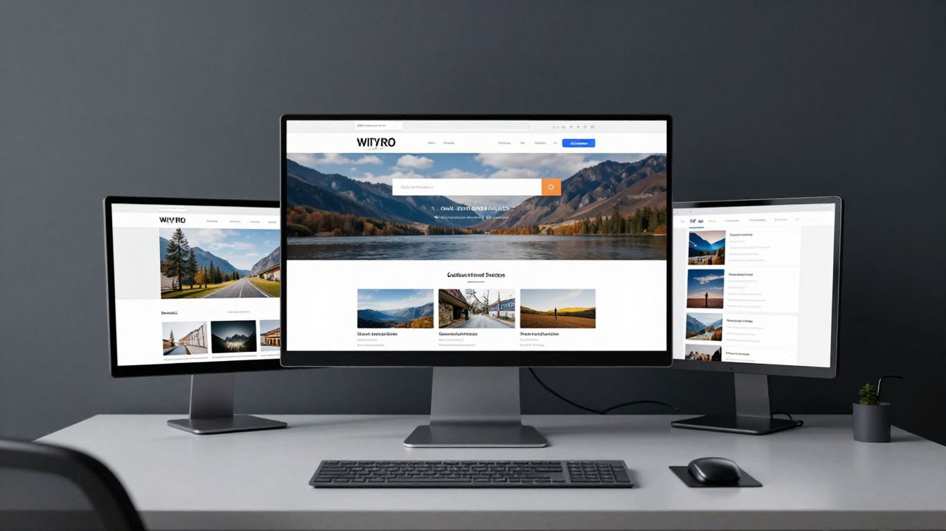
Prioritise mobile-first design to accommodate the majority of modern gallery visitors.
Key Takeaways
Improving the digital presence of cultural institutions requires a shift towards intuitive, high-performance design that centres user needs. By following these core principles, organisations can build a more sustainable and engaging digital footprint.
Prioritise mobile-first design to accommodate the majority of modern gallery visitors.
Streamline navigation to ensure event information is never more than two clicks away.
Optimise asset delivery to maintain fast load times without sacrificing high-resolution artistic detail.
Implement accessible design standards to ensure every visitor experiences the exhibition comfortably.
Adopt rigorous performance monitoring to identify and resolve user friction points in real-time.
Optimise mobile navigation for arts websites
For many cultural institutions, the mobile experience is the primary touchpoint for potential visitors. If your navigation is cluttered or inconsistent, you risk losing an engaged audience before they even see the artwork. Strategic design and digital growth principles dictate that the most effective sites prioritise simplicity, helping users find exactly what they need without cognitive overload.
Simplifying complex menu structures
Most arts websites suffer from over-populated menus that reflect internal organisational departments rather than visitor intent. A clearer approach involves distilling your taxonomy into high-level categories that align with common visitor journeys: visiting, exhibitions, and ticketing. When you structure navigation according to how people actually behave, you reduce bounce rates and increase meaningful exploration.
Implementing sticky navigation bars
Scrolling is the default human action on mobile devices, yet users frequently lose their place on long exhibition pages. By integrating a sticky navigation bar that remains pinned to the top of the viewport, you provide constant access to primary actions. This subtle design choice ensures that users can quickly navigate back to the homepage or current exhibition information without having to scroll all the way to the top.
Using clear calls-to-action for tickets and events
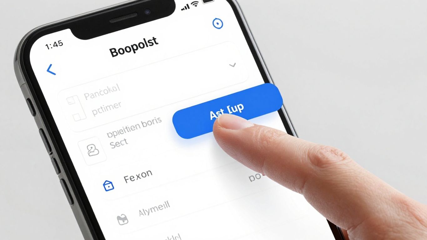
Buttons should be designed for touch rather than mouse clicks, providing enough surface area to avoid accidental mis-taps. A distinct, high-contrast call-to-action placed prominently encourages rapid progression toward attendance. When these elements are placed strategically, they transform a passive browse into a direct commitment to visit.
Improving search functionality for gallery archives
Search should be more than a simple text field hidden in the footer. By implementing intelligent autocomplete and category filtering, you allow researchers or casual visitors to dive into deep archives with speed and precision. A functional search tool essentially serves as a curator for your wider digital collection.
Streamline visual content and performance
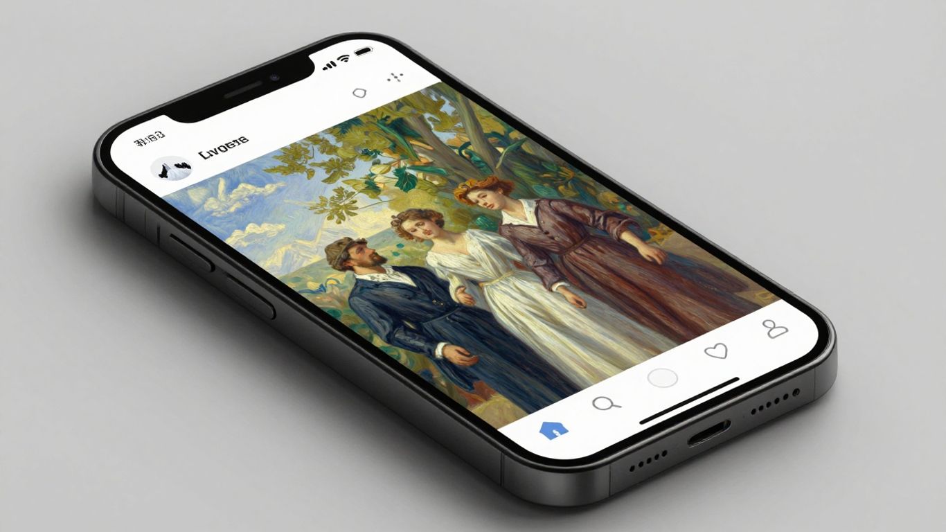
Large-scale imagery is the hallmark of any high-quality gallery site, but it must not be purchased at the cost of device performance. The objective is to balance aesthetic impact with technical efficiency, delivering digital growth that does not penalise users on slower connections.
Techniques for high-resolution image compression
Next-generation formats such as WebP or AVIF allow for significant file size reductions while maintaining visual fidelity acceptable for mobile displays. By automating this compression at the server level, you ensure that every image added to a collection meets performance benchmarks automatically.
Leveraging lazy loading for digital portfolios
Loading a full page of high-resolution digital art simultaneously is a major performance bottleneck for mobile browsers. Lazy loading defers the delivery of off-screen images until the visitor scrolls into their vicinity, prioritising immediate visual feedback.
Managing video content in responsive layouts
Video can enrich the story of an exhibition, but it requires careful implementation to prevent layout shifts. Modern responsive coding styles allow for fluid containers that retain aspect ratios across different screen sizes, ensuring the video remains viewable without forcing the layout to break.
Reducing server response times for media-heavy pages
Optimising your backend infrastructure is essential for complex portfolios. Using content delivery networks ensures that assets are served from the server closest to the user's location, drastically lowering latency. This type of infrastructure work is why leveraging design systems is so critical, providing a stable foundation to build and update content without systemic bloat.
Ensure accessibility and inclusive design
Accessibility is not a feature but a requirement for modern public-facing content. Designers must ensure that no portion of the population is excluded from experiencing digital exhibits because of visual or motor impairments.
Meeting WCAG standards for visual impairments
Adhering to accessibility guidelines ensures your site is usable by people who rely on assistive technologies. The common standards are listed below for quick reference regarding basic web usability improvement:
Compliance Level | Target Audience | Implementation Focus |
|---|---|---|
Level A | Basic access | Minimum keyboard navigation |
Level AA | Standard accessibility | Adequate contrast ratios |
Level AAA | High accessibility | Full assistive technology support |
These guidelines foster a more welcoming environment for everyone, creating an inclusive and welcoming digital space that aligns with the mission of most arts organisations.
Enhancing contrast and readability on small screens
High-contrast text against backgrounds is essential for readability in variable light conditions. Smaller displays demand larger, more legible typography to prevent eye strain and ensure content accessibility for all visitors.
Designing touch-friendly interactive elements
When designing for touch, interaction areas must be sufficiently padded. Smaller interactive targets on a mobile screen result in user frustration and errors. Large, well-spaced buttons are the bedrock of a successful touch-friendly interface.
Incorporating screen reader compatibility for art descriptions
Adding descriptive alternative text to all art imagery allows screen reader users to understand the context and beauty of a collection. It is the digital equivalent of an audio guide, essential for comprehensive accessibility.
Refine the mobile booking and ticketing process
Converting a visitor into an attendee during their mobile session is the ultimate goal. A streamlined process ensures the final transaction is as smooth as viewing the exhibit information itself, avoiding common mobile UX pitfalls that plague many commerce sites.
Minimising input fields for frictionless checkouts
Every unnecessary field within a checkout form represents a point where a user might abandon the task. By keeping input requirements to the absolute minimum—such as basic contact details and payment—you significantly increase the likelihood of success. We recommend a focus on the following core fields for any mobile booking flow:
Primary attendee contact information
Date and time slot selection
Payment method selection
Order summary validation window
These four elements provide enough data to complete the transaction while keeping the visual load manageably low.
Integrating mobile wallets for secure payment
Mobile wallets represent the height of efficiency for digital ticketing. They remove the need for manual card entry, which is error-prone on smaller devices, providing a seamless and highly secure outcome for the user.
Providing clear order confirmation and ticket delivery
Post-transaction anxiety is avoidable when you provide immediate, clear feedback. Sending confirmations immediately to the inbox or directly into the user’s mobile wallet ensures they feel confident they have successfully booked their slot.
Handling waitlists and availability updates in real-time
When exhibitions reach capacity, clear real-time updates save your users from failed checkout attempts. Providing a simple waitlist signup option is a professional way to manage disappointment and maintain interest for future visits.
Adopt a mobile-first content strategy
Mobile-first content isn't just about shrinking desktop content; it is about rewriting the narrative to suit the context of a handheld device. You must merge UX principles with art communication. Think of the mobile screen as a conversation, not a brochure.
Prioritising critical information for mobile views
What matters most to someone visiting your gallery within the hour? Usually, it is location, opening times, and ticket status. If this information is not immediately visible, the strategy has failed to put the user first.
Adapting long-form exhibition descriptions for scrolling
Long-form text in a dense block is visually intimidating on a phone. The professional digital solution involves breaking descriptions into short, bite-sized sections separated by imagery or interactive cards, making the reading experience more dynamic.
Creating engaging interactive previews for exhibitions
Interactive previews allow users to explore snippets of an exhibition before they arrive. Whether it is a rotating 3D asset or a swipeable image gallery, these previews build excitement and deepen the visitor connection.
Streamlining event calendars for smaller displays
Complicated grids do not translate well to mobile screens. An alternative, scrollable 'card' format for event calendars is often easier to parse, offering users a clean, readable overview of upcoming dates.
Monitor and test mobile UX performance
Effective digital strategy is never finished. By keeping a close eye on mobile design inspiration and current metrics, you can iterate your way to a better result. Testing is the only way to prove your hunches about your users are actually correct.
Using Google Search Console for mobile usability issues
This tool is invaluable for detecting high-level technical issues that are hidden from the naked eye. It alerts you to pages that violate mobile best practices, such as text that is too small or elements that are too close to touch.
Conducting user testing sessions with mobile prototypes
There is no substitute for watching a real person interact with your prototype. Observational testing reveals the friction points you didn't even know existed, allowing you to fix logical flaws before they hit production.
Analysing bounce rates and drop-off points in booking flows
If you see a surge in drop-offs at the payment stage, you have a conversion problem. Deep analysis of these events helps isolate whether the issue is technical, like a slow load, or structural, such as a confusing button label.
Keeping abreast of mobile UX trends in the arts sector
Design is an evolving practice. By regularly reviewing performance analytics and peer activity, you ensure your organisation stays relevant and competitive in the cultural sector. Stagnation is the greatest risk to your digital growth.
Conclusion
Creating an exceptional arts website mobile UX is a continuous commitment to the visitor’s digital journey. By streamlining your navigation, prioritising performance, and fostering inclusion, you ensure that your institution provides a high-quality experience that respects the time and attention of your audience.
Frequently Asked Questions
Why is a mobile-first design strategy important for arts organisations?
Individuals increasingly use mobile phones to find information about exhibitions or purchase tickets while on the go. If a site is not optimised for this, it creates a significant barrier to entry, potentially leading to lower visitor turnout.
What are the most common mobile navigation mistakes?
Common pitfalls include using non-standard menu icons, menus that require too many clicks to reach essential information, and buttons that are placed too close together to tap accurately on small screens.
How does page loading speed affect visitor engagement?
Studies consistently show that users abandon pages that take more than a few seconds to load. For arts websites, slow speeds turn dynamic, exciting content into a frustrating wait, often resulting in users moving to other sites.
Can accessibility measures enhance my site for all users?
Absolutely. Improvements like higher contrast, larger font sizes, and clearer navigation benefit everyone, not just those with assistive technology requirements, as they create a more professional and readable site overall.
What is more important: high-resolution images or fast speed?
Both are essential, but you don't have to choose one over the other. Advanced compression techniques allow you to retain the visual beauty of artwork while providing the fast load times expected by mobile browsers.
How can I make my ticketing process less frustrating?
Focus on reducing 'taps' by minimising the number of input fields needed to book, using mobile-native payment methods, and providing immediate confirmation after the purchase process has finished.
How often should I test my mobile performance?
Ongoing testing is best, ideally integrated into your regular digital review schedule. Monthly check-ins allow you to catch technical issues early and ensure that your evolving collection of content remains performant for all devices.