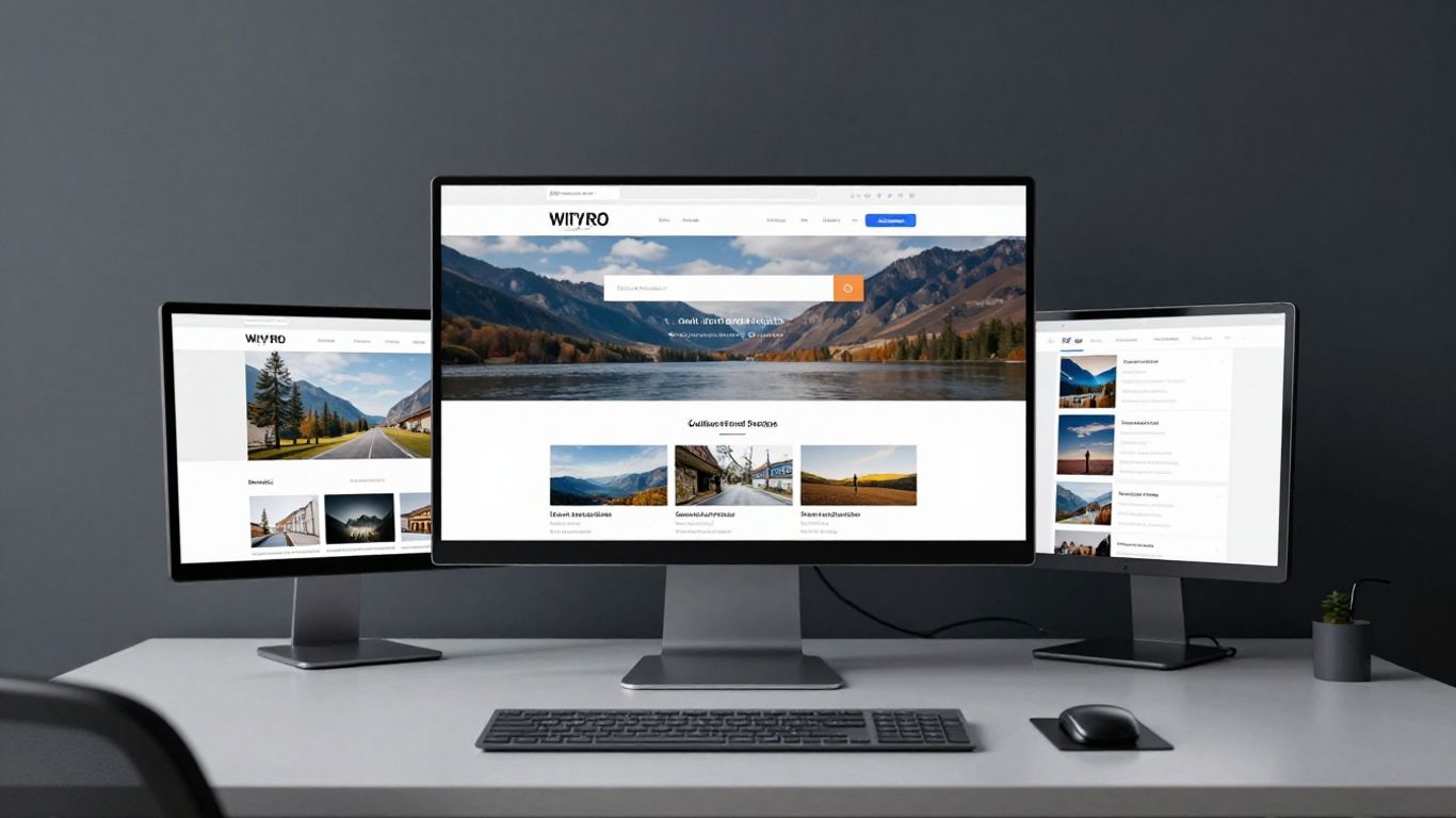
Define clear visitor personas to tailor the web experience.
Key Takeaways
Optimising how visitors interact with your institution online requires balancing emotional storytelling with a frictionless technical experience. This article explores how to bridge these two worlds to foster lasting growth for cultural organisations.
Define clear visitor personas to tailor the web experience.
Prioritise utility and clarity above the fold on your homepage.
Streamline ticketing funnels to prevent unnecessary drop-offs.
Implement accessibility standards early to reach broader audiences.
Use data-backed technical foundations to support long-term scalability.
Defining the primary user journey for new visitors
Identifying common visitor personas
Every institution attracts a wide array of individuals, from school groups and history enthusiasts to time-poor tourists looking for a quick cultural hit. By segmenting your audience into distinct profiles, you can ensure the digital interface serves their specific needs rather than assuming every visitor wants the same journey. Understanding these archetypes allows for more intentional design decisions at the Noran studio level, where we focus on how these personas navigate through information.
Mapping the path from discovery to booking
Once you internalise the visitor’s motivations, the next step involves plotting the sequence of events from their initial search to confirmed booking. A visitor often needs clarity on opening hours, exhibition themes, and prices before they commit to a transaction. Successful institutions maintain a structured flow that guides this process naturally.
Initial awareness through search or social discovery.
Verification of essential logistics like opening times.
Consideration of specific exhibitions and event calendar.
Seamless transition into the secure booking portal.
Eliminating navigation friction points
Reducing user effort throughout the site is paramount. If a potential attendee has to click more than three times to locate essential information, they are likely to disengage or pursue other plans. Often, this requires simplifying the site hierarchy to minimise clutter while keeping key resources visible.
Strategic homepage layout for museum website design
Prioritising essential information above the fold
Your homepage acts as the digital storefront for your museum. Visitors arriving for the first time should instantly understand where they are and what is available, avoiding unnecessary scrolling. Placing critical logistical details top-most ensures the user feels immediately oriented and capable of planning their visit.
Implementing clear calls to action for tickets and hours
There is no room for ambiguity when it comes to conversions. Prominent, persistent call-to-action buttons should lead users directly toward museum website design goals, such as buying tickets or checking daily schedules. Maintaining this clarity helps keep users on path without visual distraction.
Showcasing current exhibitions to drive initial interest
Engaging visitors requires more than just functional logistics; it demands an invitation into the world you present. High-impact visuals of current displays serve to capture interest, providing a compelling reason for the user to commit to their visit today.
Optimising booking and ticketing funnels
Minimising steps in the checkout process
Simplifying your digital infrastructure can dramatically improve results. Noran frequently observes that cluttered checkout processes lead to abandonment, but by removing non-essential fields, organisations can complete more bookings in less time.
Building confidence with transparent pricing
Ambiguity regarding hidden fees or complex tiered pricing will often cause a visitor to abandon their purchase at the final stage. Displaying total costs early in the process creates a layer of honesty that encourages completion. Building trust early is essential for any institution aiming to manage a consistent stream of daily visitors.
Reducing cart abandonment with guest checkout options
Requiring mandatory account creation is one of the most common barriers to effective conversion. Providing a guest checkout option allows the visitor to finalise their journey without administrative friction, which is vital for sites seeing high volumes of one-time traffic.
Prioritising accessibility and inclusive design
Ensuring WCAG compliance for visual and auditory impairments
Accessibility is not a secondary concern; it is a foundational requirement for modern web presence. Following established accessibility standards ensures your content reaches everyone regardless of their physical abilities, allowing for a more inclusive cultural experience.
Applying accessible colour palettes and contrast ratios
Colour should be used thoughtfully to distinguish content without creating barriers for those with visual impairments. Using tools that verify contrast ensures that text remains legible against background imagery and page elements, which is a key part of responsible digital growth.
Utilising screen-reader-friendly document structures
Logical HTML structure is just as important as visual design. Semantic markup enables screen readers to interpret your layout correctly, giving users with visual impairments a smooth, coherent browsing experience that mirrors the visual intent of the site.
Leveraging visual storytelling to convert visitors
Balancing high-quality imagery with page load speeds
High-resolution media communicates the beauty of an exhibition, but excessive file sizes can damage performance. Optimising these elements to look sharp without taxing the visitor's connection is a deliberate balancing act required for a professional online presence.
Using engaging video content to highlight the atmosphere
Motion can convey the unique spirit of a space in a way that static text cannot. Short, high-quality clips are effective at demonstrating what a visitor will experience, helping to manage expectations and increase excitement during the decision-making process.
Crafting compelling exhibition copy for diverse audiences
Exhibition text needs to be both inclusive and inviting. Avoiding niche jargon ensures that your content remains accessible to a broad public, while descriptive language helps hook the interest of those visiting for the first time.
Developing a mobile-first digital planning tool
Adapting interactive maps for smaller screens
Mobile visitors often need to navigate your site while standing in your lobby. Mobile-first tools like interactive maps must be designed to feel responsive and intuitive on small handheld screens, rather than simply shrinking a full-sized desktop layout.
Simplifying menu structures for mobile users
Mobile navigation requires a minimalist mindset. By collapsing complex menus into a clean, easy-to-tap interface, you allow visitors to find the "Plan your visit" link quickly without fighting with large, cumbersome navigation bars.
Streamlining 'Plan your visit' content for easy navigation
Mobile users are typically goal-oriented, often seeking parking info or ticket pricing. Keeping this core subset of information prominent ensures the mobile user receives exactly what they need at the moment they need it.
Technical foundations for high-converting sites
Optimising loading times for global visitors
Performance is directly linked to retention. Noran prioritises speed as a key metric for all digital platforms, recognising that technical efficiency is the bedrock upon which high-converting experiences are built.
Integrating reliable CRM and CMS platforms
Managing content should be efficient for your internal teams. A well-integrated CMS eliminates the struggle of updating event pages, ensuring that the information visitors see is always accurate, current, and perfectly aligned with your internal records.
Using analytics to monitor conversion rates and drop-off points
Data provides the final word on how your site performs. By monitoring where users disengage, you can make informed adjustments to your design. Below is a structural summary of how these metrics translate into actionable site improvements:
Metric Category | Targeted Action | Expected Outcome |
|---|---|---|
Page Load Time | Optimise media assets | Reduce initial bounce rate |
Checkout Flow | Remove form fields | Increase booking completion |
Navigation Path | Streamline site menu | Lower average time to task |
These metrics allow for iterative growth where data, not guesswork, drives your next site update.
Conclusion
Building a website that effectively converts first-time visitors is a persistent process of listening to your audience’s needs and refining their digital path accordingly. Whether you are improving your booking funnel or ensuring your visual content meets modern accessibility standards, the goal is always to create a frictionless connection between your institution’s mission and the people who want to experience it. By focusing on sustainable technical infrastructure and clear, human-centric design, you create a space that does not just inform visitors, but reliably brings them through your doors.
Frequently Asked Questions
What is the most important element on a museum homepage?
Clear, accessible information regarding tickets, location, and hours is vital because it addresses the immediate needs of visitors planning a trip.
Why should accessibility be integrated from the start of a design project?
Retrofitting accessibility is often technically complex and expensive; incorporating it early ensures all users have equal access from launch.
How many steps should a booking process contain?
While the exact number varies by requirement, the ideal process uses the absolute minimum number of clicks necessary to confirm a transaction.
What role does mobile responsiveness play in visitor behaviour?
Most visitors rely on mobile devices to check times and locations while on the go, making mobile-first design essential for capturing interest.
Should I use high-resolution images on my website?
Yes, but they must be optimised for speed to ensure that high performance is maintained alongside aesthetic quality.
How can a museum track if their website design is successful?
Success should be measured by monitoring conversion rates, booking completion metrics, and user feedback to identify areas where visitors face friction.
Is it better to use a custom website or a template?
Both offer advantages, but the choice should be guided by your institution's growth scale, budget, and specific needs for unique digital functionality.