Define a clear brand voice before selecting visual elements.
Key Takeaways
Creating a cohesive visual identity requires balancing technical precision with artistic intent across diverse outputs. The following points summarise the essential steps for maintaining brand integrity.
Define a clear brand voice before selecting visual elements.
Audit existing competitor landscapes to ensure distinctiveness.
Establish rigorous colour and typography hierarchies early.
Handle technical assets with specific formats for print and web.
Maintain brand consistency through ongoing cross-platform testing.
Establishing a core brand foundation
Developing an impactful brand requires moving beyond aesthetic appeal to create a system that governs your organisation's decisions. When you align your visual strategy with your core mission, you ensure that every interaction reinforces your identity. Noran Design focuses on building these lasting systems to provide clarity and operational coherence for growing organisations.
Defining your artistic brand voice
Your brand voice acts as the foundation for all communication, dictating the personality that your audience engages with. By selecting a specific tone, you help customers predict the experience they will have when interacting with your organisation. Once this voice is firm, translating it into visual language becomes an intuitive next step.
Understanding target audience expectations
Audiences today require consistent storytelling that feels relevant to their immediate needs. Understanding your users involves analysing their pain points and tailoring your visual responses to provide comfort and trust. When you build with clarity, you bridge the gap between abstract concepts and meaningful user interaction.
Setting long-term visual goals for arts visual identity design
Defining success for your project means anticipating how your needs will evolve over time. You should build a scalable visual strategy that adapts to growth, allowing you to sustain a strong presence without constant re-branding. This approach ensures that your assets continue to provide value long after their initial launch.
Conducting a competitor visual audit
Analysing the broader market helps you identify gaps where your unique aesthetic can shine. By observing what works well for others, you can avoid common pitfalls while finding opportunities to stand out. This audit informs your roadmap for carving a unique space in your niche, helping you define where your visual language sits in relation to others.
Optimising typography and colour palettes
Managing design systems requires strict attention to how colours and typefaces behave across physical and digital mediums. Achieving fidelity depends on understanding the unique properties of your display and print environments. At Noran, we advocate for setting clear standards that prevent visual drift.
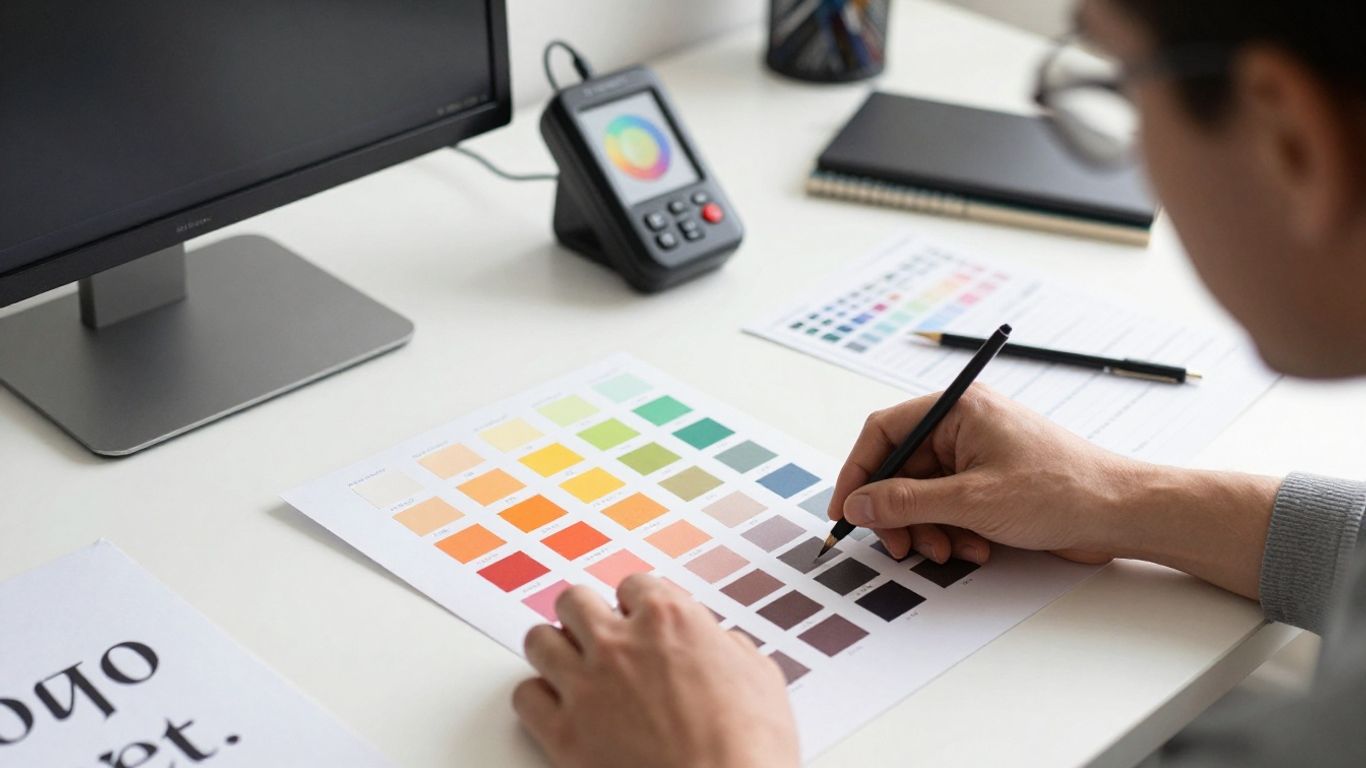
Managing colour profiles for CMYK versus RGB
Digital screens operate using RGB light-based systems, whereas print relies on CMYK ink absorption, leading to significant variations in output. You must manage these profiles carefully to ensure your brand colours appear faithfully whether viewed on a mobile device or a physical brochure.
Technique | Digital (RGB) | Physical (CMYK) |
|---|---|---|
Primary Colour | Use hex codes | Use Pantone swatch |
Text Contrast | Web Content rules | Legibility standards |
Image Quality | Compressed webp | High-resolution tiff |
This table illustrates the fundamental differences in how files should be processed to guarantee that your brand identity remains stable regardless of the final output channel.
Selecting accessible typefaces for screen and paper
Typefaces must maintain readability whether they are rendered as pixels on a high-definition monitor or ink on physical paper. Selecting a typeface with robust weights and clear character distinction allows your content to remain accessible to all users, adhering to WCAG 2.1 AA standards wherever possible.
Establishing primary and secondary colour hierarchies
Your colour hierarchy guides the viewer through your brand content by prioritising information layout. By assigning specific roles to primary versus secondary colours, you ensure that the most important details command attention. This structural approach prevents your design from feeling cluttered or overwhelming.
Applying contrast rules for digital readability versus print clarity
Different mediums require unique rules to maintain text legibility without sacrificing your chosen style. These guidelines help your team apply consistent standards across all design projects:
Increase font weight for high-glare screen environments.
Monitor dot gain on standard uncoated paper stock.
Check colour vibration in saturated, high-contrast layouts.
Verify sufficient contrast for light text on dark backgrounds.
Following these steps helps ensure that your messaging is never lost, whether a reader is browsing a website or holding a printed report.
Navigating technical requirements for print and digital
Technical infrastructure is the silent partner of every successful design project. By preparing your assets correctly for their destination, you remove friction from the production process and accelerate delivery times. Noran Design provides frameworks to ensure these technical steps are handled systematically for your digital operations.
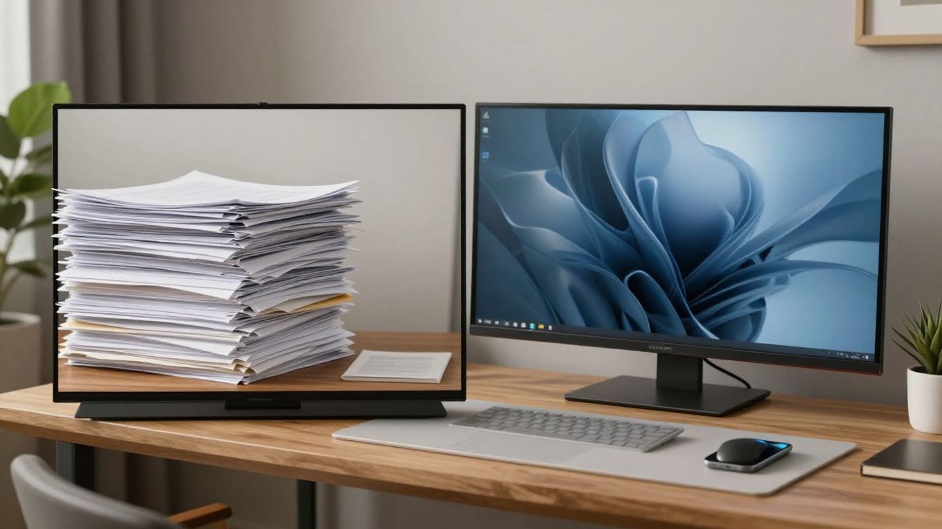
Vector versus raster asset management
Vector assets remain necessary for logos and iconography that require infinite scaling, while raster images are essential for rich, detailed photography. Knowing exactly when to utilise each type prevents quality degradation and keeps your files organised. Maintaining a single source of truth for these master files is critical for keeping citations consistent with your wider design documentation.
Handling bleed and print margins for physical marketing materials
Physical outputs demand precise physical parameters including bleed areas that prevent white edges during the cutting process. Establishing these margins early in the design file setup prevents expensive errors during printing. It is part of creating a cohesive visual identity that survives the transition into the real world.
Optimising asset sizes for faster web loading
Web performance depends heavily on the weight of your images and scripts. By compressing assets to the smallest viable size without sacrificing visual fidelity, you improve user retention and satisfaction. This focus on performance reflects a commitment to optimizing digital operations as you grow.
Choosing appropriate file formats for different output channels
Different channels demand specific formats such as SVG for icons on the web or PDF/X for professional print requirements. Selecting the right format ensures that your design retains its integrity and colour accuracy throughout its lifecycle.
Ensuring cross-platform scalability
Scalability allows your design to function across varying screen sizes and print formats without diluting its potency. By creating a modular system, you empower your team to iterate quickly while maintaining a professional appearance.
Creating a responsive logo system
Your logo must evolve to fit the space available, moving from a full-length wordmark to a simple icon for smaller interfaces. A responsive approach ensures that your brand remains instantly recognisable as a user transitions from a desktop browser to a mobile application.
Simplifying complex elements for mobile interfaces
Interactions on small screens require the removal of unnecessary noise to keep the user focused on the core call to action. Simplifying your graphics allows the key elements to breathe and makes navigation more intuitive for mobile users.
Maintaining visual integrity across large-format print
Large-format printing demands higher resolution and clearer focus to ensure that design elements do not become pixelated. Testing these assets before final production is standard practice for maintaining your brand reputation in public spaces.
Documenting usage guidelines in a central style guide
Centralised guidance ensures that every stakeholder understands how to apply your brand assets uniformly. This documentation typically covers typography, colour usage, and spatial requirements, serving as the definitive resource for team members and external partners.
Testing for consistency across mediums
Continuous feedback allows you to refine your visual language as your organisation changes and interacts with new markets. Testing ensures that your assumptions about brand recognition hold true in practice.
Performing a side-by-side brand audit
Reviewing digital and physical materials together highlights any drift in your colour or font treatments. This side-by-side process helps you anchor your assets to one another, creating a feeling of harmony across your entire suite of collateral.
Refining the brand look through mock-up testing
Mock-ups allow you to visualise how your designs work in real-world contexts before finalising them. Seeing a label on a product or a banner on a digital billboard reveals issues that might be invisible on an isolated artboard.
Gathering feedback on brand recognition
Speaking with your audience provides direct insights into how well your visual identity is performing. If people recognise your brand values at a glance, you know your messaging is hitting the target. This qualitative data is just as important as technical performance metrics.
Adjusting design elements for platform-specific constraints
Every platform has unique limitations that may force you to adapt your look slightly for the sake of functionality. Being flexible within your framework allows you to work with these constraints rather than fighting against them, ensuring your presence feels native to its environment.
Conclusion
Ultimately, a successful visual identity relies on the thoughtful application of design rules across every medium your business occupies. By focusing on scalability, technical precision, and a deep understanding of your audience, you build an identity that grows alongside your business and provides a lasting connection with your customers.
Frequently Asked Questions
How often should a visual identity be refreshed?
A visual identity should evolve when your business goals change rather than on a set calendar timeframe. Refreshing elements is necessary if your current system prevents growth or fails to reflect your core values over several years.
What are the main benefits of a responsive logo?
A responsive logo ensures that your primary brand mark remains legible and impactful on a watch face or a large billboard alike. It maintains recognisability while preventing the design from feeling too small or cluttered in cramped digital spaces.
How does print branding differ from digital?
Print branding relies on fixed spatial relationships and specific ink processes like CMYK, whereas digital branding is dynamic, fluid, and light-based. Managing both requires creating assets that can adapt to high-resolution physical requirements and responsive screen environments.
Why is a style guide vital for branding?
A style guide provides a single source of truth for everyone working on your brand, ensuring consistent use of typography, colours, and imagery. It reduces errors in production and helps maintain professional standards across different departments and internal teams.
Can consistent branding influence business growth?
Consistency builds trust and makes your organisation more recognisable, which can directly lead to higher engagement and customer loyalty. When a brand provides a cohesive experience, potential clients feel more confident about the professional quality of your services.
What role does typography play in accessibility?
Good typography ensures that all users, regardless of visual capabilities, can read your message easily on paper or a screen. Proper line spacing, weight, and font selection are essential for meeting accessibility standards and keeping your audience engaged.
Should small organisations focus on complex branding?
Smaller organisations benefit from simplified, highly modular systems that are easy to manage and update. Focus on the core visual elements that best represent your mission rather than overcomplicating your identity with unnecessary graphics or varied layouts.