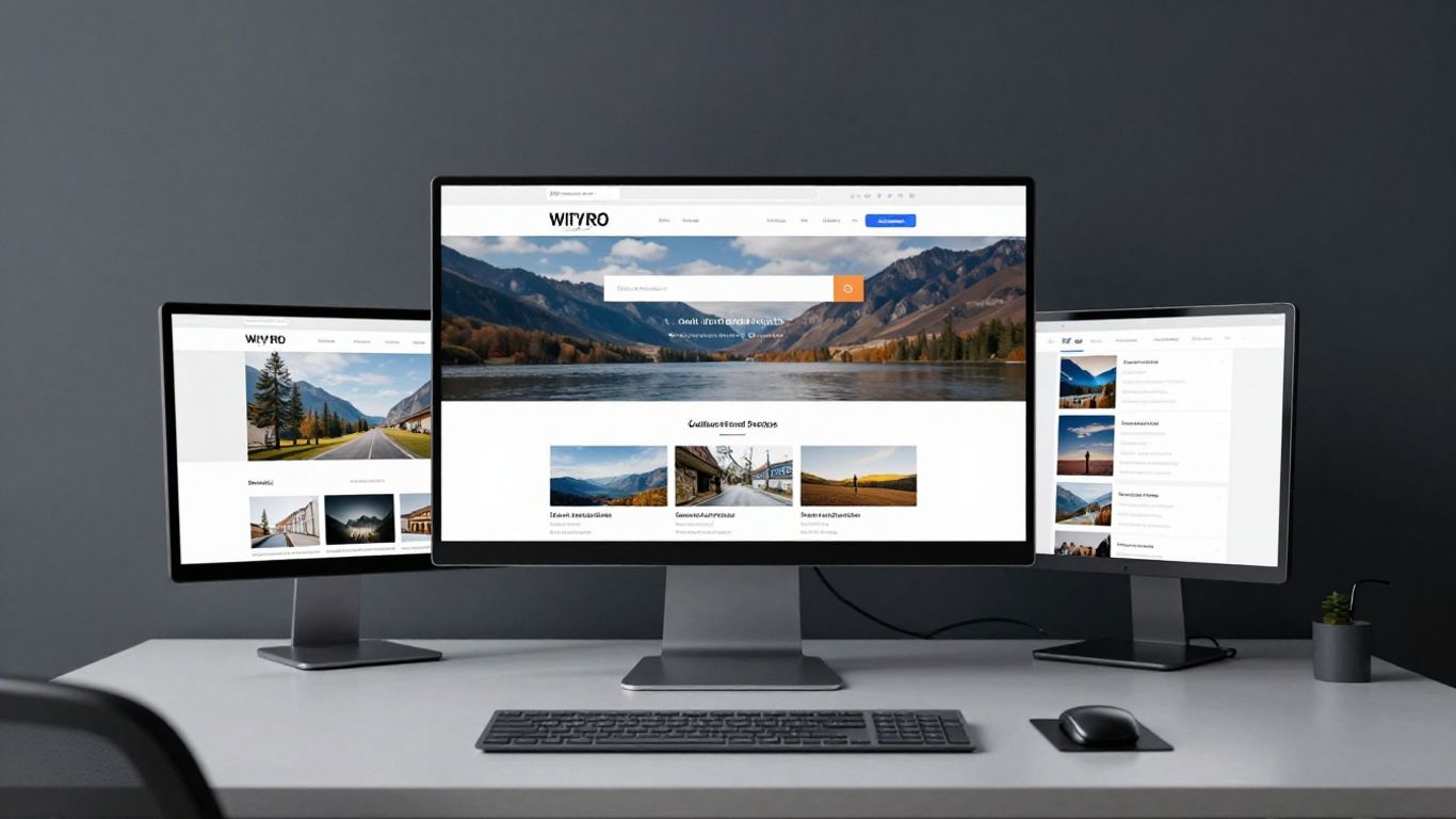
Prioritise clear value propositions over cluttered design aesthetics.
Key Takeaways
Creating a functional homepage for your institution involves balancing artistic values with user-centric design. These five pillars form the foundation of a successful digital presence.
Prioritise clear value propositions over cluttered design aesthetics.
Use intuitive navigation to guide diverse visitor segments effectively.
Integrate real-time event booking to reduce friction in the visitor journey.
Build institutional trust through editorial content and transparent partnerships.
Encourage long-term support with clear conversion points for members and donors.
Making a strong first impression with your hero section
The hero section acts as the primary gateway to your institution's digital world. It must immediately communicate who you are and why a visitor should engage further, whether they are a local resident or an international guest. Noran Design suggests that clarity is the most effective tool when defining this initial interaction, ensuring that the visual impact supports rather than overwhelms the core message.
Prioritising high-impact visual imagery
High-quality photography or video that reflects the unique atmospheric quality of your physical space provides an immediate emotional connection. It is not enough to simply display a beautiful image; the visual must resonate with the specific experiences offered within your gallery or performance halls, setting the tone for the entire visitor engagement.
Crafting a concise mission-led value proposition
Your value proposition should be a synthesis of your core purpose and the unique benefit provided to the attendee. By stripping away complex jargon, you allow newcomers to instantly grasp the relevance of your cultural activities. This clarity helps potential patrons connect their personal interests with your institutional goals.
Implementing clear primary calls to action
Primary buttons must be designed with the visitor's primary goal in mind, typically focusing on ticket booking or membership sign-ups. When these actions are prominent and follow a logical reading path, it eliminates uncertainty regarding the next step, effectively guiding users through a seamless digital experience.
Optimising navigation for diverse visitor needs
Providing an accessible and logical path through your website is essential for ensuring that varied audience segments find precisely what they need. Without a clear architecture, visitors often abandon their search even when your content is highly relevant to their interests.
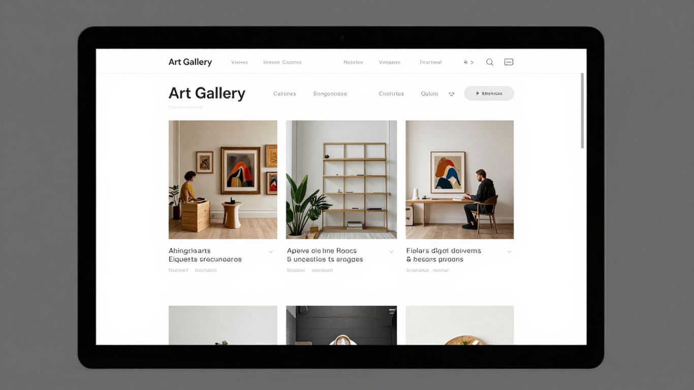
Simplifying the primary menu structure for intuitive browsing
Streamlining the top-level navigation prevents cognitive overload and encourages exploration across different sections of your site. Limiting your main menu items helps categorize distinct user needs, such as practical visit information, event programmes, and ongoing institutional research.
Balancing accessibility standards with distinctive brand aesthetics
Achieving compliance with accessibility guidelines does not necessitate a sacrifice in visual character. Instead, focusing on high-contrast typography and thoughtful whitespace allows your unique voice to remain prominent while ensuring that every member of the public can interact with your digital infrastructure effectively.
Designing for mobile-first user journeys and touch interaction
Most visitors will encounter your organisation via a smartphone, requiring a design that addresses the realities of mobile interaction. By designing primarily for touch, you improve usability for those scanning for essential information on the go, making your digital footprint much more helpful.
Showcasing programming and event calendars
A dynamic calendar that reflects the true variety of your offerings is essential for maintaining audience excitement and encouraging repeat attendance. Often, institutions struggle with static content that fails to capture the immediacy of their ongoing programmes.
Highlighting current and upcoming exhibition highlights
Strategic curation of what appears on your homepage allows you to push specific exhibitions or performances that are central to your current mission. By clearly distinguishing between current highlights and future announcements, you help manage visitor expectations and build anticipation for your seasonal offerings.
Integrating real-time booking and ticketing functionality
When a user finds an event that aligns with their interest, they should be able to secure access immediately without navigating through multiple pages. We recommend organizing these options clearly to help visitors manage their choices efficiently.
Event Category | Accessibility | Booking Status |
|---|---|---|
Rotating Galleries | Fully Accessible | Open |
Evening Lectures | Limited Access | Pre-register |
Member Previews | Membership Only | Available |
Incorporating this level of transparency into your booking functionality ensures that patrons can plan their schedules effectively, reflecting the structured approach advocated by Noran Design.
Categorising events by audience interest or programme type
Filtering events allows users to navigate your diverse offerings based on personal preference, such as academic lectures, children's workshops, or evening music sessions. This granular approach to data organisation makes it easier for regular guests to find events that align with their specific cultural priorities.
Building cultural trust and institutional authority
Establishing your organisation as a reputable authority requires a consistent demonstration of your commitment to excellence and community transparency. By providing evidence of your impact, you deepen the relationship with your audience, moving them beyond casual curiosity toward professional interest.

Featuring editorial content and exhibition reviews
Long-form content that provides historical or thematic context creates a richer understanding of your exhibitions for every visitor. By sharing reviews and critical reflections, you ground the institutional voice, showing that you value intellectual discourse as much as visual impact.
Displaying accreditation logos and key sector partnerships
Visibility of your institutional network and formal partnerships reinforces your standing within the cultural sector. This institutional verification provides an unspoken signal of quality and reliability that is particularly important for audiences engaging with web design strategies in a professional or educational capacity.
Showcasing creator and artist contributions to the organisation
Highlighting the individuals who sustain your mission is vital for building human connection. Their work is the heart of your organisation, and giving credit where it is due helps potential supporters understand the human effort and dedication that defines your success.
Converting visitors into supporters and members
Supporting your cultural goals depends on creating a clear, frictionless pathway for those who wish to contribute financially to your longevity. The following actions have proven effective for institutions looking to strengthen their philanthropic foundation:
Use clear labels for donation tiers.
Highlight the direct impact of membership fees.
Provide a simple path to recurring monthly contributions.
Offer visible incentives for donor recognition.
These steps facilitate a supportive environment where patrons feel confident in their decision to invest in your future. By detailing how funds are used, you build the trust necessary for substantial philanthropic growth.
Strategic placement of membership sign-up prompts
Membership prompts should appear in high-context locations where a visitor is likely to appreciate the value of an annual pass. By offering this at the point of high engagement, you convert interest into long-term commitment without disrupting the primary visitor experience.
Streamlining the donor journey to support philanthropic goals
Removing unnecessary fields in your donation forms significantly increases the rate of successful contributions. Simplifying this process acknowledges the visitor's generosity and makes the act of giving a smooth and positive interaction.
Tailoring messaging to distinguish regular patrons from one-off guests
Recognising the different motivations of your visitors allows you to offer more relevant calls to action as Noran Design has explored in their broader audience development strategies. By speaking directly to their specific relationship with your institution, you encourage deeper involvement across different engagement tiers.
Fostering community engagement and reach
Community engagement is the lifeblood of any modern cultural institution, relying on open channels and consistent outreach. By actively listening and responding through digital tools, you can ensure that your organisation remains a living, breathing part of the fabric of your community.
Integrating dynamic social media feeds of real-time activity
Social channels provide a space to highlight what is happening behind the scenes, offering a candid look at the daily operations of your team. This transparency creates a more relatable institution and encourages followers to participate in the ongoing conversation.
Creating clear pathways to newsletter subscriptions and updates
Email remains one of the most reliable methods for sustaining contact with your audience after they have left your site. By presenting a simple subscription prompt that details what they can expect, you build a loyal reader base that stays connected with your seasonal updates and announcements.
Highlighting ongoing educational resources and community outreach programmes
Promoting educational opportunities shows that your commitment extends beyond the exhibition space into the community at large. These resources demonstrate that you are an open and accessible institution, eager to help others discover new knowledge and creative skills.
Conclusion
Achieving an effective homepage strategy requires constant attention to how content and utility interact to support your cultural mission. By focusing on site clarity, intuitive navigation, and transparent communication, you build a digital experience that mirrors the quality and depth of your physical events, ensuring lasting engagement with your diverse audiences.
Frequently Asked Questions
How often should my organisation update its homepage banners?
Updates should align with your major seasonal programming, ensuring that recurrent visitors always encounter fresh, relevant imagery that reflects the current mood of the institution.
What is the most effective way to handle long exhibition titles?
Keep headers clean by using primary keywords to grab attention, then provide the full title using distinct typography that improves readability without cluttering the screen.
Should I include a history of the institution on the homepage?
Keep the homepage focused on current activities, but ensure a prominent link to an "About" or "History" page is readily accessible in the primary menu for inquisitive visitors.
How can I make donation forms feel more personal?
Incorporate photography of the specific departments or projects that receive funding, giving donors a clear visual representation of the real-world impact of their gift.
Is it necessary to have a dedicated section for social media feeds?
While optional, these feeds can provide a sense of current activity and community connection that makes an organisation feel more alive and responsive to contemporary trends.
How do I balance artistic imagery with accessibility needs?
Use text overlays with sufficient contrast, maintain clear screen-reader alt text for every visual asset, and verify that navigation remains fully functional for keyboard-only users.
What metrics are most important for homepages?
Focus on engagement rates, exit points, and conversion success on your primary action buttons to understand exactly how effectively your site supports your institutional goals.